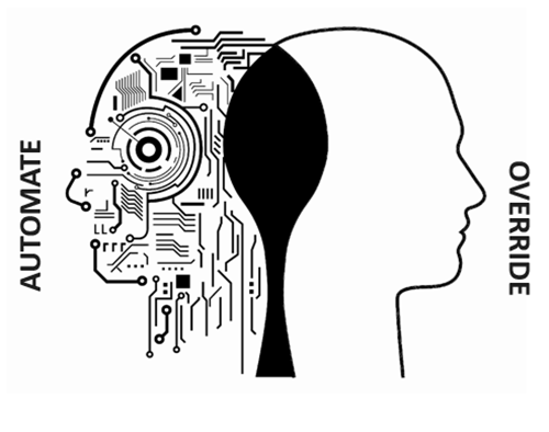
IoT
-
At our in-person Autodesk University events, it's common for our R&D teams to interview customers and to brief them on ongoing research projects and upcoming product features. This is a really valuable part of our R&D process: this feedback helps us make sure that our products and services help the industry move forward by addressing real customer pain. This year is a bit different, of course: rather than hanging around the Idea Exchange – which I know many of us struggle to find time for – you can sign up for sessions via the AU website (or the links in…
-

It's time: the full, interactive schedule for this year's all-digital Autodesk University is now online. You can go ahead and start bookmarking your favourite classes today. Assuming you're one of the 85,000 (and counting!) people who have registered for the event. If you haven't already registered, don't worry: you can still do so for free. (There are still plenty of tickets left. 😉 So to get things rolling, here's a link to my AU 2020 class for you to bookmark and watch from November 17th. You can expect some interesting news to be announced (or at least repeated) in this…
-
This year's Halloween was destined to disappoint: we'd held out some hope until the 30th that the kids (which just means our youngest, at this point) would end up being able to go trick-or-treating in our village. Understandably – but disappointingly – the announcement came that any kind of trick-or-treating was off the cards for this Halloween. Stricter rules about groups of people were also announced, but with effect from today. From today onwards any kind of public or private event can have a maximum of 5 people present. Given the acceleration of cases in Switzerland, this is completely appropriate.…
-

This year has been strange at so many levels that it seems a bit petty to highlight one particular area. But preparing material for Autodesk University 2020 has certainly been one such area, and it's very fresh in the mind of AU speakers around the world. With this year's event being all digital, it's clear that the AU team had to find a way to get classes delivered remotely: one option would have been to live-stream them all, but at some point the decision was made to get everything pre-recorded for on-demand delivery. (On-demand classes are not the only way…
-
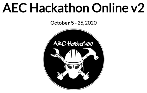
If you enjoy hackathons – and have the time to spare – then you could spend the next month hacking, should you so desire! Last Friday the 2nd online AEC Hackathon kicked off with its lightning round. The event is about now a week in: it started officially on October 5th, but it really only started in earnest with Friday's kick-off and lightning round. The event will run until October 25th, so you still have time to find or build a team and participate. It was fun listening to the recording of the lightning round – which was short and…
-
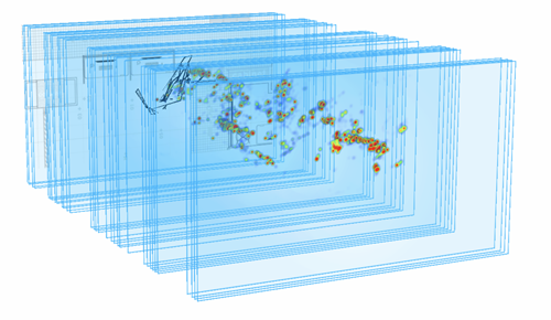
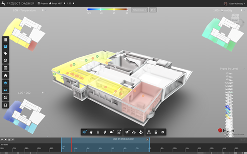
Over the last month or so we've been focused on the benefits brought to Project Dasher by combining 2D heatmaps with our traditionally 3D view of the world. We started by creating 2D heatmaps, making them resizable, adding lots of them inside Dasher, and then making them pinnable per-level, before introducing the idea of overlaying building systems information, too. Most recently we took a sneak peek at the topic of today's post, a new UI that simplifies access to these 2D (and 3D) heatmaps. The idea came up during a team meeting: as we realised we had this combinatorial explosion…
-
This week has been a little crazy in terms of presentations. On Monday it kicked off with an internal project review followed by a presentation to a class of Masters students from the University of Southern California (it was a lunchtime session for them, so it was a late evening one for me). It wrapped up yesterday with the generative design session for the Swiss Data Science Center, which despite a few technical hitches (not on my side, thankfully) seemed to go pretty well. I was told there were upwards of 400 attendees registered for the event, but I have…
-
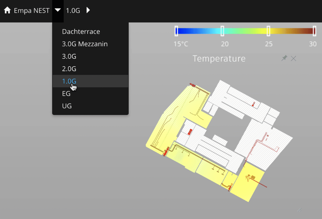
As a recap, so far in this series we've looked at creating 2D heatmaps, making them resizable, adding lots of them inside Project Dasher, and then making them pinnable per-level. There are two main tasks left for the completed feature – which will form the core of my upcoming class for AU2020 – which are to add information on building systems and to implement a UI to make these new views easier to access. Today we're focusing on adding building system information. Let's first step back and talk about why this is important… One of the key insights we've derived…
-
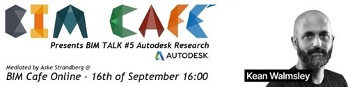
I've been invited to talk about Project Dasher at the KEA BIM Café Talk on Wednesday of this week. Many thanks to Aske Strandberg for organising and moderating this event. It's being held online (of course) at 4pm CET on Wednesday September 16th. The session is primarily targeted at students from KEA – the Copenhagen School of Design and Technology – but guests are very welcome. If you'd like to join, feel free to sign up here. I'll be sharing a number of really cool enhancements I've been making to Dasher during the pandemic-related travel ban – only some of…
-
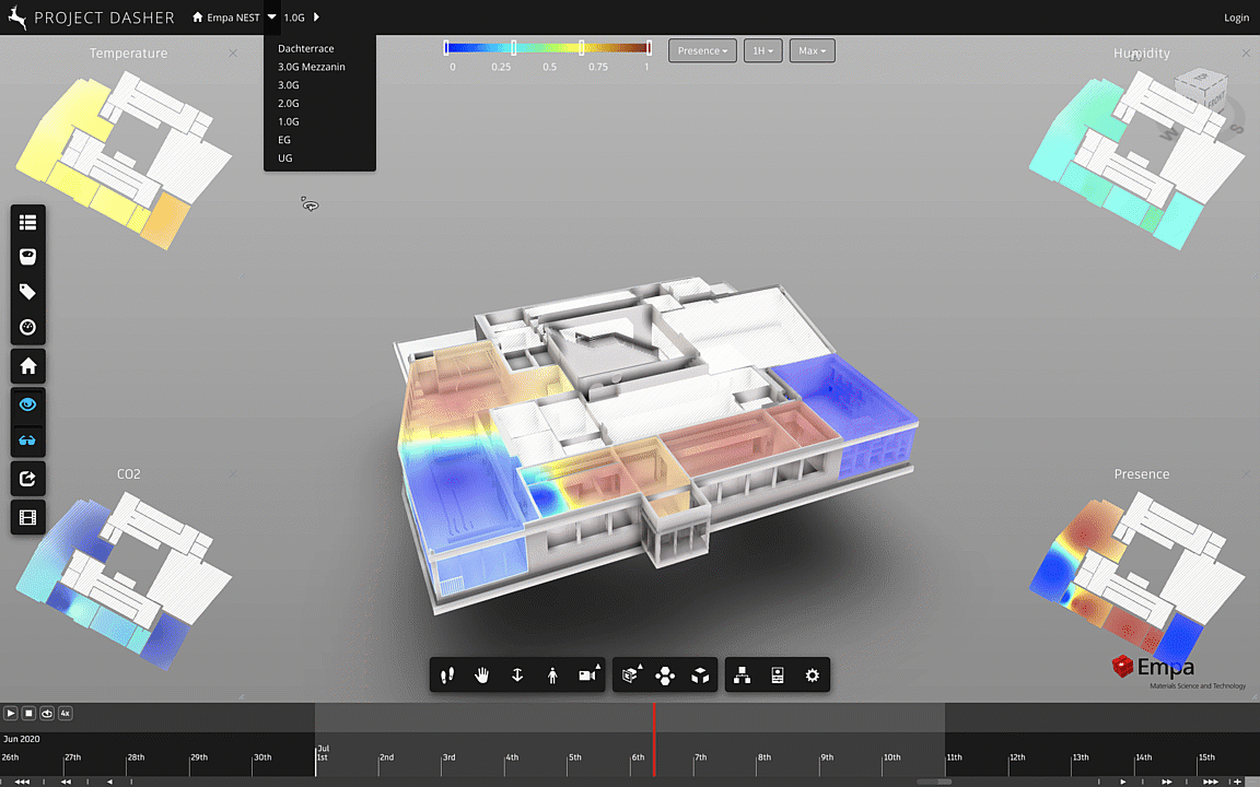
So far in this series we've looked at creating 2D heatmaps, making them resizable, and then adding lots of them inside Project Dasher. I've mentioned a few times – and I've seen the same commented via LinkedIn – that viewing data from multiple building floors at the same time would be beneficial. As a reminder, here's what happens when you change floors with the current implementation: The UX to implement some kind of "pinning" mechanism was non-trivial, but possible. The way I ended up thinking about this was as follows: We still want generic panels that will show data for…