IoT
-
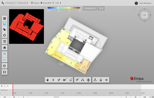
In the last couple of posts in this series, we looked at how we've been able to include a 2D heatmap view inside Project Dasher and make it resizable via a square, transparent panel. This post is really just to let you know that we've now extended the capability to support multiple heatmaps, which is particularly interesting if you want to compare data from different sensor types across the floor of a building. (I often say that the value in a tool like Dasher is in its ability to correlate multiple streams of data – such as occupancy with CO2…
-
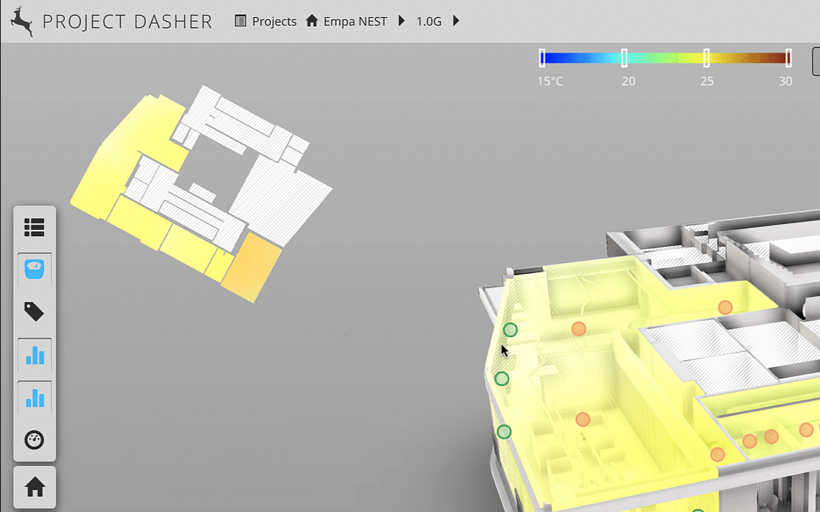
In this recent post we looked at a new 2D heatmap capability that we've added to Project Dasher. In this post we look at what was needed to make this heatmap resizable – but with a fixed aspect ratio – as well as being movable and displayed with a transparent background. Luckily, this previous post shows how to create a transparent, movable window – which we already use to show our surface shading legend – so we were able to use that as a basis for today's implementation. Firstly, let's take a look at it working. Note the fact the…
-
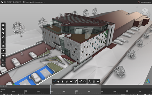
A nice article was published recently on Redshift regarding Kingspan's new IKON building. The article focuses particularly on describing how IKON furthers Kingspan's commitment to innovation and sustainability. In this post I thought we'd look in a bit more detail at how Autodesk Research has been involved in the IKON project, specifically regarding the deployment of sensor and camera technology to help create a digital twin of IKON inside Project Dasher. IKON is Kingspan's new headquarters and global innovation centre at Kingscourt in County Cavan, Ireland. Here's an introductory video that talks about this project and shows a couple of…
-
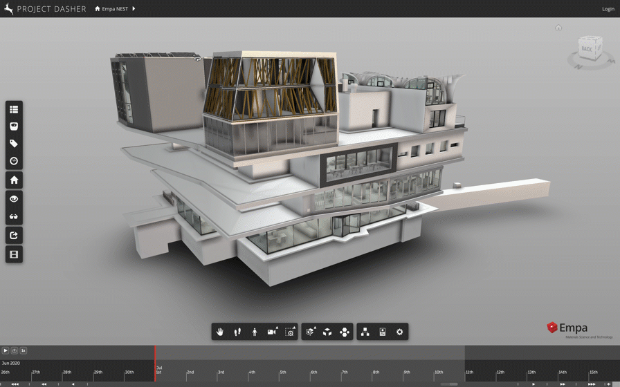
A week or two ago, I had a meeting with some colleagues to discuss future needs for Project Dasher. One of these requirements related to an exhibit where we're going to want to ignore all the 3D visualization of sensor data, and focus on the 2D case (I.e. where we shade a 2D floorplan with the sensor values). When this came up I thought to myself "oh, this could be a good driver for us implementing a 2D workflow inside Dasher", something I've chewed on in the past. This time around, I started off thinking about whether to use a…
-
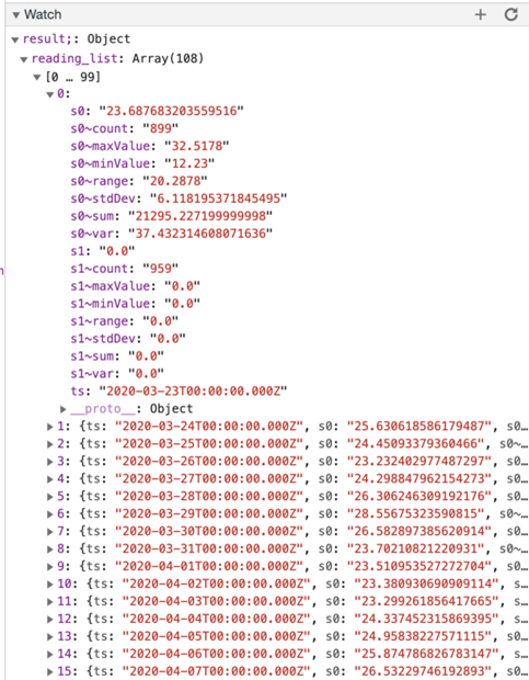
Last week I posted about how roll-ups in the time-series back-end used by Project Dasher enable some interesting visualization opportunities. When my colleague Hali Larsen saw the post, she made a really interesting suggestion: It would be cool if the user could select whether the heatmap visualizes the Max, Min, or Average of the data for the selected rollup. (Yet another drop down...) The advantage would be that someone looking for a feature in the data would see the "spikes" whereas when you use the rollups as they currently work you lose a lot of the variability of colour due…
-
When we started developing Dasher in late 2009 – back then it had a desktop client – one of the main drivers was around providing an interface to explore IoT data (at the time measuring building performance) responsively in a 3D context. To do this we knew that we needed some way to summarize the raw sensor data at different levels of detail: there was no way we could wait around for the client to query years of sensor data in order to visualize a high-level summary, for instance. In our time-series back-end the team developed a mechanism we refer…
-

Since starting up back in 2013, the AEC Hackathon team has organised 43 in-person events in various cities around the world. This year being "special", they've taken the plunge and set up a couple of online events, the first was held from July 6th-26th while the second will be held from October 9th-25th. I was on holiday for the first two weeks of the July event, so could only really participate by presenting a topic during the final week. Here are a couple of screenshots of me – taken from the session recording, which should still be available on-demand –…
-
These days I belong to the Research Engineering team at Autodesk, headed by Tony Ruto. (Tony joined Autodesk with the acquisition of Within Technologies, back at the end of 2014, where he was CTO.) Tony's team is a shared resource for the various "Core Science" and "Industry Futures" teams within Autodesk Research: we help develop prototypes and platform capabilities that are used elsewhere in the organisation, and also have members of our team embedded within these other teams. The team is growing, which is quite exciting: there are a number of open positions that I'd encourage you to share or…
-
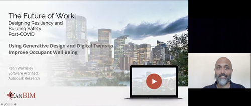
This post is a bit of a grab-bag of various event-related topics. The first one (chronologically, if not in terms of the title above) is the availability of session recordings from the recent CanBIM event: "The Future of Work: Designing Resiliency and Building Work Safety Post-COVID". My own session was entitled "Using Generative Design and Digital Twins to Improve Occupant Well Being". As it was the first session of the day – with a new web streaming platform – there were a few teething issues for the sponsor's introduction (and the session auto-closed a little too promptly, which meant no…
-
There's an exciting job posted for a key role in a new project (product?) team at Autodesk named Constructwin. Here's some information from the posting: Do you want the opportunity to be part of a startup environment and have a big impact on a brand-new product? Are you looking to be at the forefront of innovative new technology that will ultimately help people imagine, design, and make a better world? If so, come join the Constructwin team at Autodesk! Our mission is to create Digital Twin technology and solutions that will transform how buildings are designed, built, and operated. I…